The list runs from Professional Colors, with its quiet pairings, to Bright Orange and Grey, and the right entry depends on where you’re wearing it: the office, a weekend, or somewhere in between.
Professional Colors suit daytime work and interviews, while Bright Orange and Grey is a weekend look.
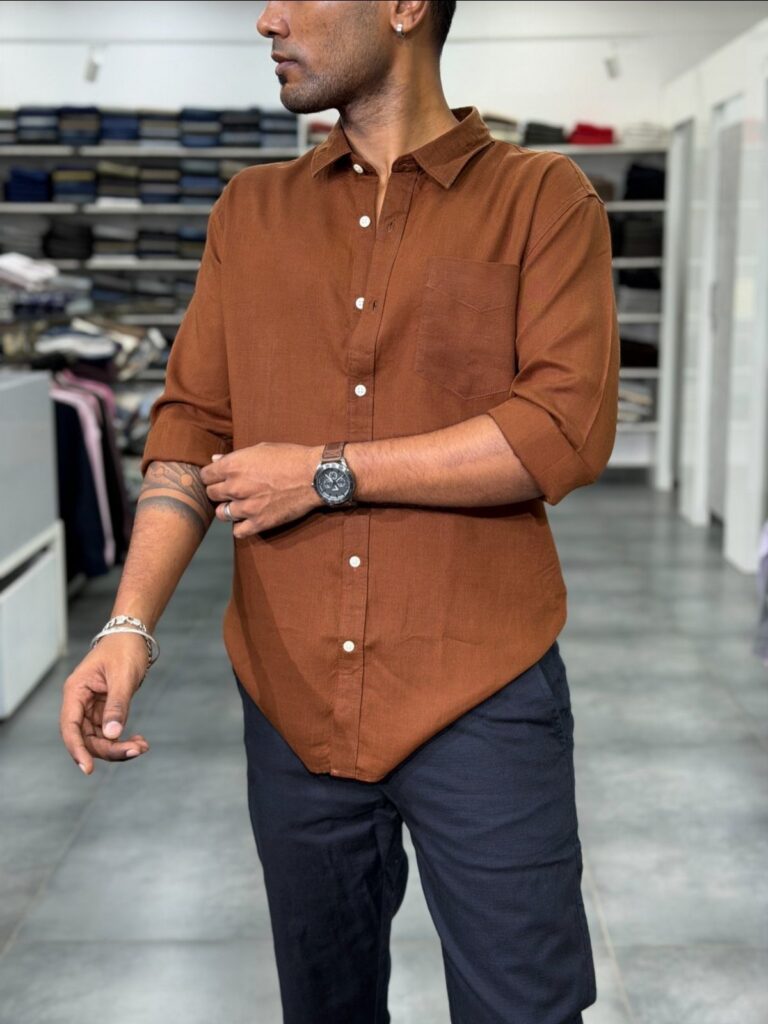
The one that shows how far the range stretches is the burnt orange shirt with deep navy trousers, since navy sits nearly opposite orange on the color wheel and keeps it from turning loud.
1. Professional Colours
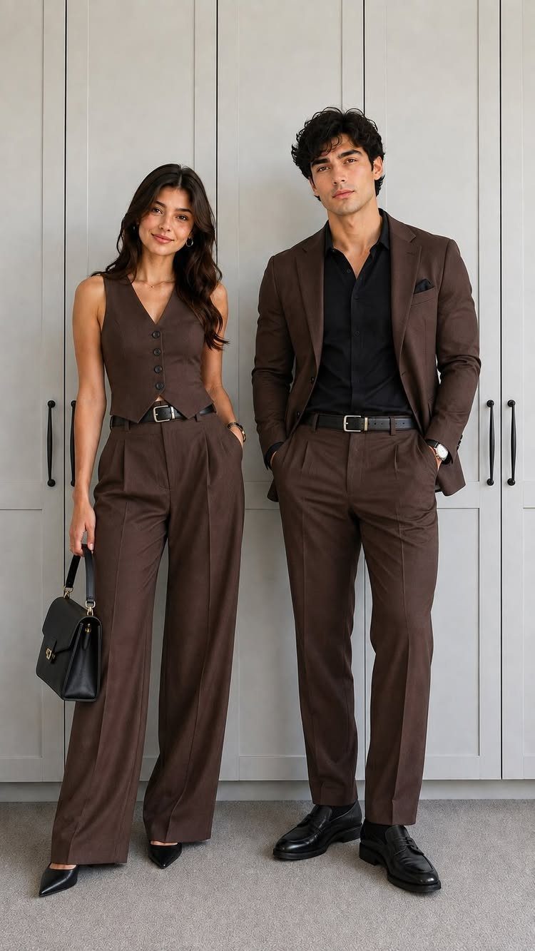
Brown and black sit closer together than most men expect, and that is why this pairing works. A dark brown suit with a black shirt stays in one tonal family, so nothing fights for attention.
Neutrals are the cheapest place to start, since the pieces repeat across a wardrobe.
A shirt one shade darker than the suit works best, and a patterned tie only adds noise, so I skip it. Matching a partner’s outfit takes no extra effort once the palette is fixed.
2. Neutral Plus a Color
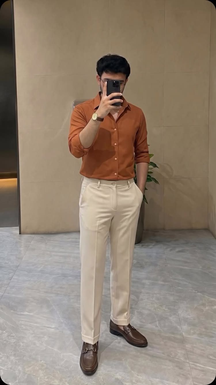
Tucking the shirt in keeps the color from looking sloppy. I would pick one bold piece and leave everything else neutral, so the eye has a single place to land.
Cream shows dirt faster than darker trousers, which is the one cost.
3. Bright Orange and Grey
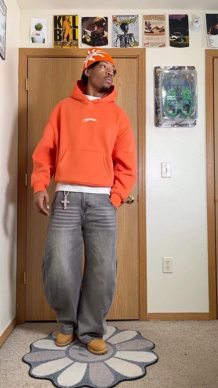
Orange from head to waist can read as a costume, and grey jeans are what stop that. The washed, baggy denim cools the hoodie down, while the matching beanie keeps the top half looking deliberate instead of accidental.
Tan boots are a smart third color because they stay warm without competing. If a full orange set feels like too much, I would keep the hoodie and swap the beanie for a grey or black one.
This is a weekend look, not an office one.
4. Reddish Brown and Tan
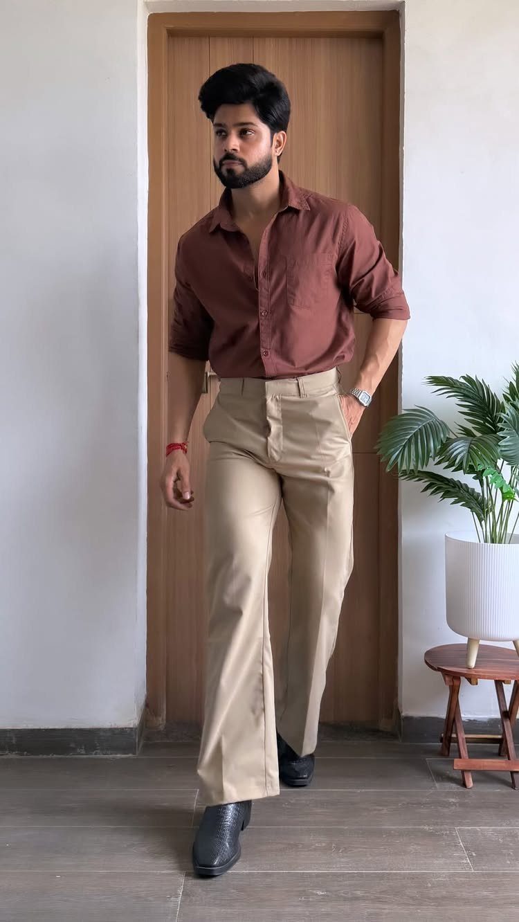
A dark reddish-brown shirt is easier to wear than it sounds, because it reads almost like a neutral. Wide-leg tan trousers pull out its warmth and leave the result soft rather than stark.
Black dress shoes make this look sharper and a little more formal. Dark brown shoes would be the gentler option, and I lean toward them for daytime.
Trousers a few shades lighter than the shirt will never blur into it.
5. Burnt Orange and Navy Blue
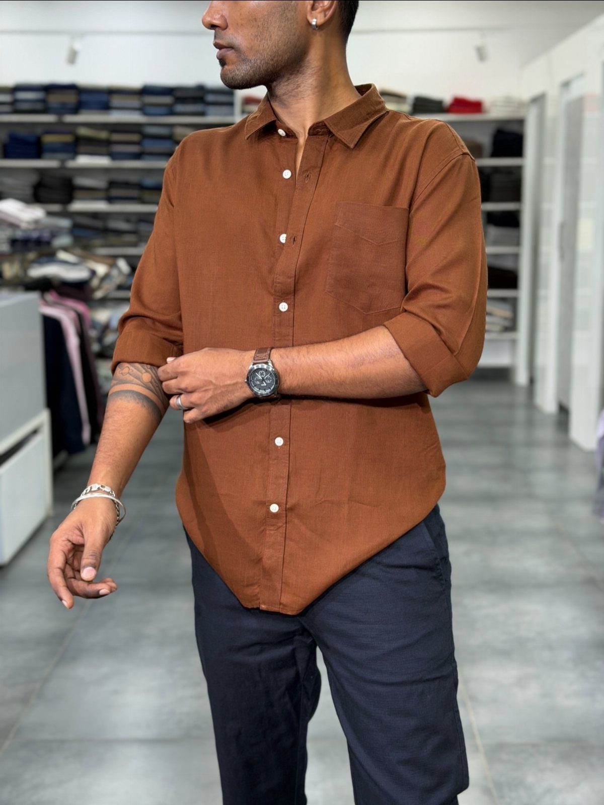
Navy is the best partner a burnt orange shirt can have. The two sit nearly opposite on the color wheel, so each makes the other look richer, and the navy keeps the orange from turning loud.
Dark trousers matter here: go deep navy, not a mid-blue, or the contrast loses its punch. Rolled sleeves make a button-down feel relaxed without extra pieces.
Brown or white shoes both work, and I would pick brown.
Color Theory Basics
Every color falls into one of three groups. Primaries are red, yellow and blue; secondaries (orange, green, purple) sit between them; tertiaries are the in-between shades like red-orange or blue-green.
Pick one color from any group and the wheel tells you what goes with it.
Colors directly across from each other make a bold pair. Colors side by side make a quiet one.
For daily dressing, I use the wheel as a check, not a rulebook. If an outfit feels off, find where each piece sits on the wheel and swap the one that clashes for a neutral.
Mood and Color
Color sends a message before you say a word, so match it to the day.
Blue reads calm and trustworthy, which is why it works for a job interview. Red reads confident and energetic, so it suits a date better than a budget meeting.
Black signals power and a little mystery.
White looks fresh and simple. Yellow reads cheerful and creative, and green reads balanced.
Choose the feeling first, then put that color in the piece closest to your face, usually the shirt or sweater. Keep the rest quiet.
Accessorizing with Color
Not ready for a full colored outfit?
Start small. Socks, a tie, a pocket square, a scarf or a belt all bring color in without changing the main look.
Sort the outfit into 3 layers: the suit or jacket leads, the shirt backs it up, and the accent comes last.
Keep the accent to one item. Two or three competing accents make an outfit look patched together, and the main garment loses its place.
Frequently Asked Questions
How to check color combination for clothes?
Find where each piece sits on the color wheel.
Think of the wheel as a quick test, not a law. When an outfit looks wrong, I replace the one clashing piece with gray, white, or tan.
What is the 3-3-3 rule for clothing?
The 3-3-3 rule is usually described as a capsule wardrobe challenge, where you rotate 3 tops, 3 bottoms, and 3 pairs of shoes.
Say you wear a blue top with white pants: brown-tan shoes or a sand-colored belt add a third shade without making the look busy.
I would also keep the accent to a single item, so the main garment stays in charge.
What two colors should not be worn together?
Avoid pairing two pure primaries or two pure secondaries at full strength, such as bright red with intense blue.
Softer or desaturated versions of the same colors work far better. Burnt orange can look loud alone, but next to navy it settles down, which is why that pairing works so well.